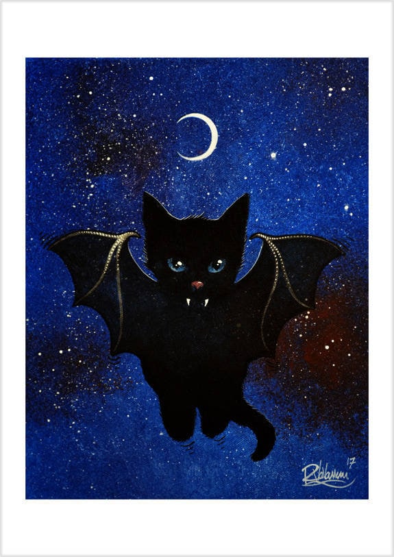
Choosing a piece of cat art for a home is, when one strips away the sentiment, a compositional problem. I paint cats from a studio in France, and over the years I have written this guide for the collectors who write in asking where, exactly, to begin. What follows is the framework I use myself, organised around four sequential decisions: which collection, which format, which scale, which palette. The mathematics of placement on the wall I keep in my placement guide; this essay is about the prior question of what to acquire.
Choosing a piece is a compositional decision, not a sentimental one
The mistake I see most often is to confuse the subject with the work. A cat painting and a painting of a cat are not the same object. The first is an arrangement of tone, line, and atmosphere whose subject happens to be a cat. The second is a portrait dressed in fur. The pieces that survive in private collections — from Léonard Foujita to Théophile-Alexandre Steinlen, and through to the contemporary studios that descend from them — persist because of how they depict, not because of what they depict. Choosing well means looking at the picture, not at the cat.
Once you accept that, the selection becomes tractable. A graphic monochrome print and a soft pastel one may both show a sleeping cat, and yet they will live in entirely different rooms and produce entirely different effects in a viewer. The four questions below are the ones I would walk through with you over the studio table.
Which collection: matching atmosphere, not species
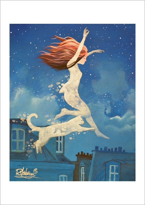
I work across eight collections, and they are organised by mood rather than by breed or pose. If you are starting from your own taste — not from a specific wall, this is where I would begin. The Moon collection holds soft nocturnal palettes — cool whites, silver-greys, deep ink blues — and reads as quietude. The Cosmos collection sits in the same family but adds constellations, scattered suns, and a sense of small interstellar travel; collectors drawn to slow attention tend to choose it. The Black & White collection strips colour out entirely and leaves rhythm, posture, and gaze — it travels well across changing interiors. The Paris collection puts cats on zinc rooftops, Haussmann balconies, and Parisian afternoon light, and reads as urban affection instead of nocturnal mystery. The Soft collection leans tender (pastels, paired cats, dreamy pinks and creams) and the Cloud collection leans dreamy (cats drifting through pale skies). The Magic collection adds small folkloric signs — ribbons, hidden plants, sigils — that pull the imagery toward a quiet personal mythology rather than astronomy. The Digital collection is hand-made digital work (made by me, not generated by AI), reproduced as a fine art print in the same range of sizes as the painting-derived collections.
If you are torn between two collections that read similarly to you (Moon and Cosmos; Soft and Cloud; B&W and Paris), the easiest way to decide is to ask which kind of evening you would rather spend looking at the wall — the answer is usually immediate once the question is posed that way.
Format: original painting, fine art print, canvas
Once the collection is decided, the format question becomes tractable. The three formats answer different questions, and confusing them is the most common buying mistake I see.
An original cat paintings in my catalogue is a single, unrepeated object — the actual surface I worked on. The originals are acrylic paintings on stretched canvas, finished with a soft satin varnish, signed, and accompanied by a certificate of originality. They suit rooms whose centrepiece should be one-of-a-kind, and collectors who want presence — not reproduction. Once sold, the work does not exist a second time.
A fine art cat print catalogue entry is a high-quality reproduction of one of my originals (or, for the Digital collection, of a hand-made digital piece). Prints are produced on professional photographic paper — the surface carries a slight sheen, the character of photo stock that keeps deep tones dense and disappears once framed under glass. Each print is signed, numbered, inscribed on the verso, and dispatched flat between two rigid protective boards, so it arrives unbent and ready for any standard mount. Prints make the same image available at multiple sizes and across several homes; they are the format I recommend to first-time buyers most often. I write about the choice between originals and prints in more depth in my comparison guide.
The canvas cat prints editions place the same imagery onto a stretched ready-to-hang surface that reads close to a painting — matte, textured, no glare under directional light. They suit modern interiors and rooms where a framed print would feel too formal.
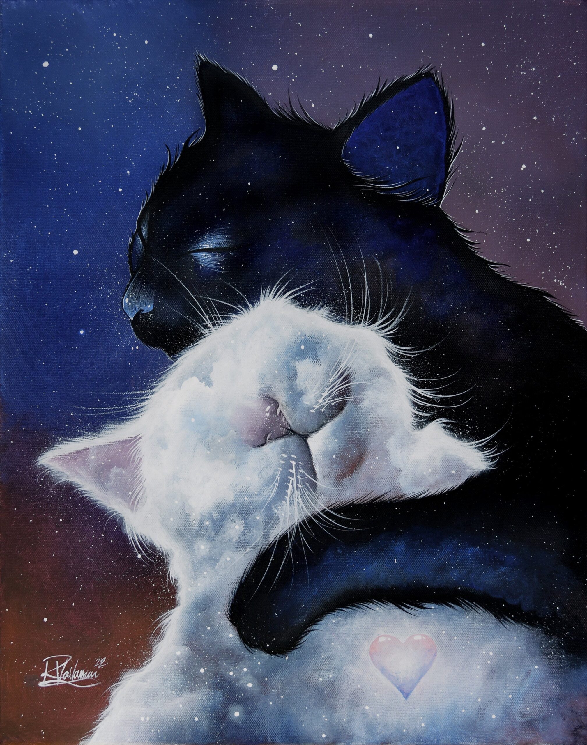
Scale: the small mathematics that rescues most decisions
Scale is the place where good choices fail most often. Three rules, applied without ceremony, will rescue almost any placement — I describe them at length in the placement guide but the short version is here.
Above a sofa or a bed, plan for the artwork to span roughly two-thirds the width of the furniture beneath. A 200-centimetre sofa, then, asks for a piece around 130 centimetres wide — single piece or gallery cluster. The centre of the work should sit at approximately 145 centimetres from the floor, the museum standard for adult sightline. Single pieces above 100 centimetres in their longest dimension dominate a room; below 60 centimetres they need either a tight cluster or a wall with no competition. Between those values is the comfortable range for almost every domestic situation.
Palette and the wall behind the work
Palette is the variable most often misjudged. Same-tone matching tends to flatten both the piece and the wall — a charcoal print on a charcoal wall reads as missing instead of present. The rule I apply is two steps removed: choose a piece whose dominant tone is two steps away from the dominant tone of the room. A pale linen room takes deep night blue well; a charcoal room takes warm cream; a strong-colour room (emerald, ochre, terracotta) welcomes the saturated grounds of the Digital or Magic collections, where palette becomes part of the composition rather than its background.
Pale walls, raw wood, and warm linens flatter the Paris and Cloud collections; darker, more architectural interiors hold the B&W collection confidently — monochrome work converses with framed photography and old prints without effort. The Moon and Cosmos collections, with their cool nocturnal palettes, prefer rooms that are not flooded with direct daylight; they reveal their depth in lamplight.
The two-minute test before you commit
Here is a habit I learned from older collectors and have kept: stand in front of the piece for two full minutes before you buy. Most decorative cat art fails this test within forty seconds — the eye exhausts the image and the wall reverts to wall. Work that holds the gaze for two minutes, that keeps revealing something at the ninetieth second, is work worth living with. I build my own pieces in many thin layers of acrylic precisely so the longest looking returns the most — my three studio cats provide the close-range reference I work from — and I describe that process in my acrylic-process article. One of the most recurring patterns I see in customer feedback (across the more than 1,200 verified Etsy reviews the studio has received, with a 4.96 average) is the phrase “more beautiful in person than on screen”: that depth is exactly what the layered acrylic builds.
Starting points for first-time buyers
First-time buyers almost always do better with a print than with an original. The financial commitment is lower, the framing decisions are simpler, and the print can move between rooms while the right wall reveals itself. The Moon and B&W collections are the reliable opening moves: both give graphic clarity, both age well across changing rooms, and both flatter a wide range of rooms.
Once you know which ambience your eye keeps returning to, an original from the original cat paintings becomes much easier to choose. Each painting is acrylic on stretched canvas, sealed under a low-sheen protective coat, signed, certified, and dispatched worldwide with tracking from France — with an optional handwritten dedication on the verso when bought as a gift. Orders frequently arrive with a small thank-you card and, when I can spare one, a second small print as a hushed bonus — a habit I have kept spanning years of shipping cat art around the world and one that recurs throughout the studio’s customer feedback.
Where to begin
The fastest way to discover your actual taste is to browse the shop without making a decision. Note which collection you keep returning to, which palette your eye refuses to leave. After three or four loops through the catalogue, the choice — collection, format, scale — will generally announce itself. The piece you keep coming back to is, with rare exceptions, the piece you should buy.
If you want help thinking about specific motifs, I have written longer pieces on the black cat as standalone subject, on the lunar cat in mythology and modern painting, and on the cosmic cat in art history. The wider fine art cat print catalogue gathers all eight collections in one place — over 340 paintings, prints, and canvas works spanning the body of the studio. If you would rather talk first, the studio Instagram (@raphael.vavasseur.art) is the simplest direct contact, and new pieces typically appear there before they are listed.