
A wall is not neutral. The room around it determines which images thrive there and which fall flat: a piece that animates a small bedroom can disappear above a long sofa, and a print that anchors a hallway can crowd a kitchen. Once a collector has chosen a piece (a decision I work through in my guide to choosing cat art), the next question is always the same: where, exactly, does it go? The placement of a print or a painting changes its bearing as much as the choice of the piece itself. The manual below is what I would walk through with you in person — three compositional rules first, then room by room, then frame and mount.
The three rules I would apply before anything else
Three principles underwrite almost every successful placement. They are compositional, not aesthetic, and they apply equally to a Foujita lithograph and a contemporary print — I have watched my own three studio cats walk past my pieces enough times to know which heights and scales feel inhabited, not merely decorated.
Sightline. The centre of the work should sit at approximately 145 centimetres from the floor — the museum standard for adult sightline. Lower in rooms where the viewer is seated; higher in transitional spaces where the viewer is standing. Most domestic placements err high, often by ten to fifteen centimetres, because the person hanging the piece is standing while doing it and unconsciously adjusts to their own eye level — not to the room’s average.
Scale. Above any piece of furniture, the artwork should span roughly two-thirds the width of the furniture beneath. A 200-centimetre sofa, then, asks for a piece — or a gallery cluster — of approximately 130 centimetres total width. Single pieces above 100 centimetres dominate a room; below 60 centimetres, they need either a cluster or a wall that lets them breathe.
Palette distance. Choose a piece whose dominant tone is two steps removed from the dominant tone of the room. Same-tone matching flattens both the work and the wall; opposite-tone confrontation tires the eye over time; two-step distance gives the piece room to register without competing with the architecture.
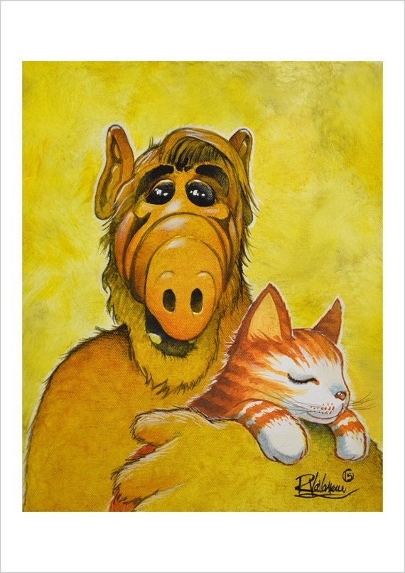
Room-by-room placement
Bedroom
Bedrooms reward intimacy. A smaller, finely-framed print near the bed often reads more powerfully than a vast one across the room, because the encounter happens at close range, often at low light, where subtle tonal work outperforms graphic punch. Hang the centre of the work between 130 and 140 centimetres from the floor — lower than the standard 145, since the bedroom viewer is more often seated or lying down than standing.
The most common bedroom mistake I see is hanging the work too high above the headboard; bring it down by ten centimetres from your first instinct, and the room will improve. For pairs (two prints side by side above the bed), keep the spacing tight — five to eight centimetres — so the two read as one composition rather than as two unrelated pieces.
Living room
Living rooms benefit from images that hold from distance. Viewers sit four to seven metres from the principal wall, which means anything subtle is lost; what survives is contrast, posture, and graphic decision.
For a sofa wall, a single large piece almost always beats two medium ones. For a long blank wall, a small gallery cluster — three or four pieces in matching frames — can fill the space with rhythm. Avoid the very common error of hanging a small piece centred above a wide sofa; the proportions look apologetic. Either commit to scale, or commit to a cluster.
Study, library, reading nook
Studies welcome depth and a slight cinematic quality. The reading-chair adjacency matters: a piece directly across from the chair will be the most-viewed work in the house. Pick it carefully; the print one returns to a thousand times must reward the thousand-and-first viewing.
Frame these pieces tightly, with a wide white mount, and they hold their own beside bookshelves without competing with the books. The viewer is close, the light is often warm and singular, the encounter long — everything that disadvantages a graphic poster favours a slow-revealing print.
Kitchen and dining
Keep cat art a few metres back from the stove and dishwasher; airborne moisture and cooking aerosols, over years, degrade paper and pigment. In dining rooms, hang the work at the height that flatters seated viewers — roughly 135 centimetres from the floor — rather than the standing 145.
Kitchens take warm, lively pieces well; dining rooms suit slightly more formal feline portraits, single-figure prints framed with a dark moulding. The collection-by-room mapping (which palette goes with which room) lives in my guide to choosing.
Children’s rooms and nurseries
The mistake to avoid is choosing for the age — not the child: a baby will not look at the wall, a toddler will not understand it, but a fifteen-year-old will be glad the room was not decorated for an infant. Choose work that reads as real art, simply gentle.
Hang lower than for adults — at the child’s eye level, not the grown-up’s — usually around 105 to 115 centimetres for a young child. As the child grows, the framing can be moved up; the room ages with them.
Hallways, stairs, entrances
These transitional spaces take taller, narrower compositions well. The viewer encounters them in passing rather than seated, which favours graphic impact over slow reading. Single vertical prints work especially well.
On stair walls, hang a series of three to five small prints at successive heights, tracking the angle of the stair. The arrangement creates rhythm without requiring symmetry. Avoid hanging single small prints in long hallways; they disappear. Either commit to a series or commit to a single larger piece.
Bathrooms and humid spaces
Print art in bathrooms is possible if the room is well-ventilated and the print is framed behind glass. Avoid placing the work directly across from a shower or above a tub. Pieces with deeper atmospheric layering benefit from drier rooms; simpler monochrome works tolerate the slightly more contained atmosphere best.
Frame, mount, and finish
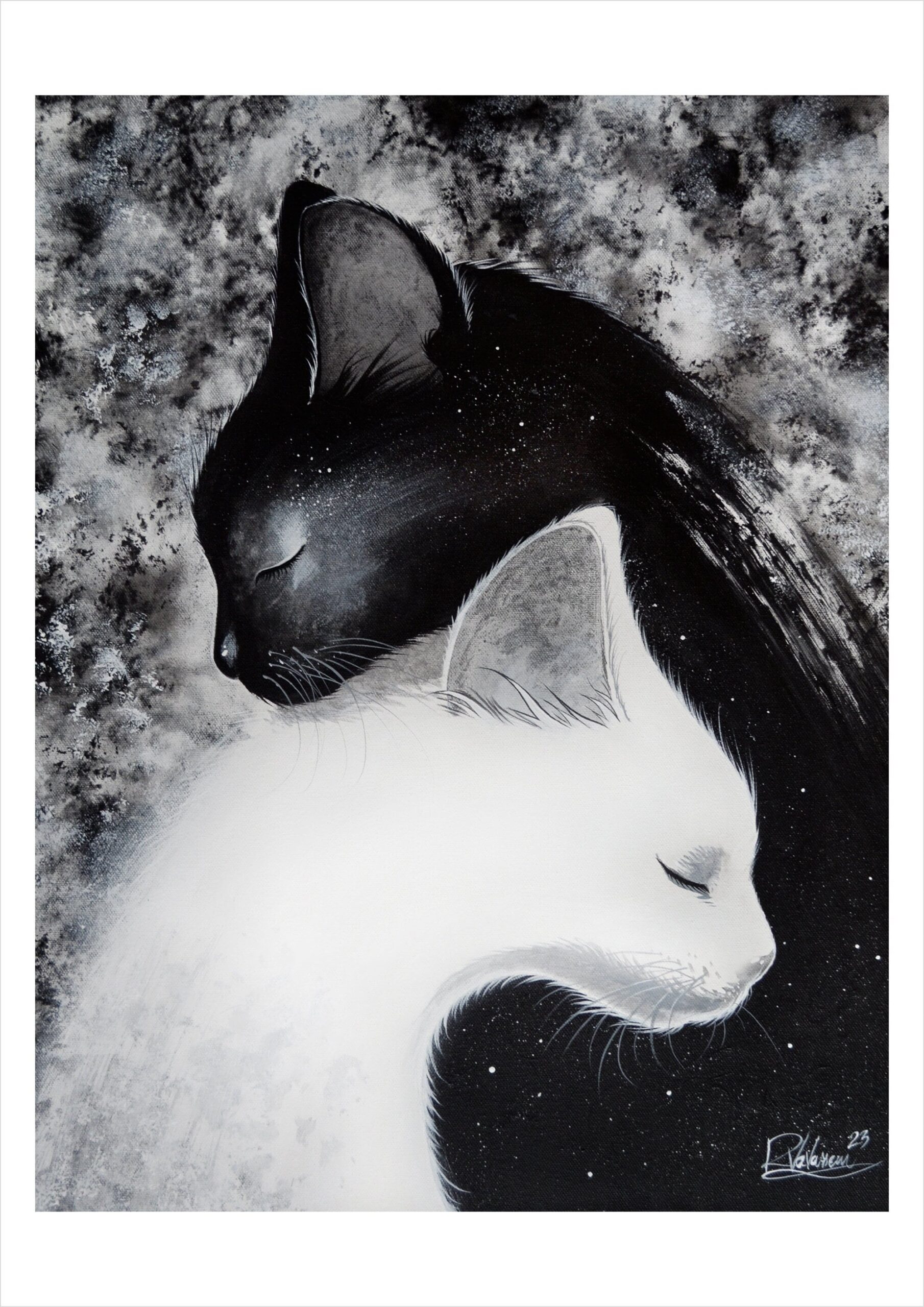
Frame choice changes the personality of a print as much as the print changes the personality of the wall. A wide white mount (often 6 to 8 centimetres on each side) adds gravity and gallery feel — appropriate for the more atmospheric, layered pieces where the image rewards breathing space. A thin white mount and a fine dark moulding give a more contemporary mood — appropriate for the more graphic, monochrome or digital pieces.
Three other compact decisions matter. Glass. Standard glass is fine for most domestic placements; anti-reflective glass is worth the additional cost in living rooms with strong window light or in spaces where the viewer is often within arm’s length. Hanging hardware. Use D-rings, not sawtooth fittings for any print above 30 by 40 centimetres; the work hangs flat and stays level over years. Wall anchor. Drywall anchors rated for 6–8 kg are sufficient for almost any framed print; for large pieces or originals on stretched canvas, locate a stud or use a heavier wall plug.
The canvas cat prints editions remove the frame question entirely, since the stretched canvas hangs as-is.
Hardware and hanging method
A few additional slight details rescue most domestic placements. Use two anchor points — not one for any work wider than 50 centimetres; the work stays level over years of incidental nudges, and the load is distributed. Mark the centre of the work on the wall with light pencil before drilling — measure twice, drill once. For pieces near doorways or radiators, allow a generous margin (at least 20 centimetres) so the door swing or heat plume does not stress the work.
If you are planning a gallery wall, lay the arrangement on the floor first, photograph it, then transfer the layout to the wall. Adjust spacing in real life by no more than 1 to 2 centimetres — what looks generous on the floor often reads too wide on the wall.
One image, several rooms
Buying a print rather than an original means the same image can move between rooms as your interior changes. This is one of the quiet advantages of the fine art cat print catalogue: you commit to an atmosphere, not to a single wall. When you find the room where the print becomes inevitable, the decision is made for you. The collectors with the longest-lasting walls in my experience are usually the ones who moved the print around for a year before committing it to its final placement — sometimes the right wall is not the wall the print was originally bought for.
For collection choice and palette decisions, see the choosing guide; for the difference between originals and prints in placement terms, my comparison article walks through scale, longevity, and provenance in more depth. For specific placement questions on a particular wall in your home, the studio is reachable on Instagram at @raphael.vavasseur.art.